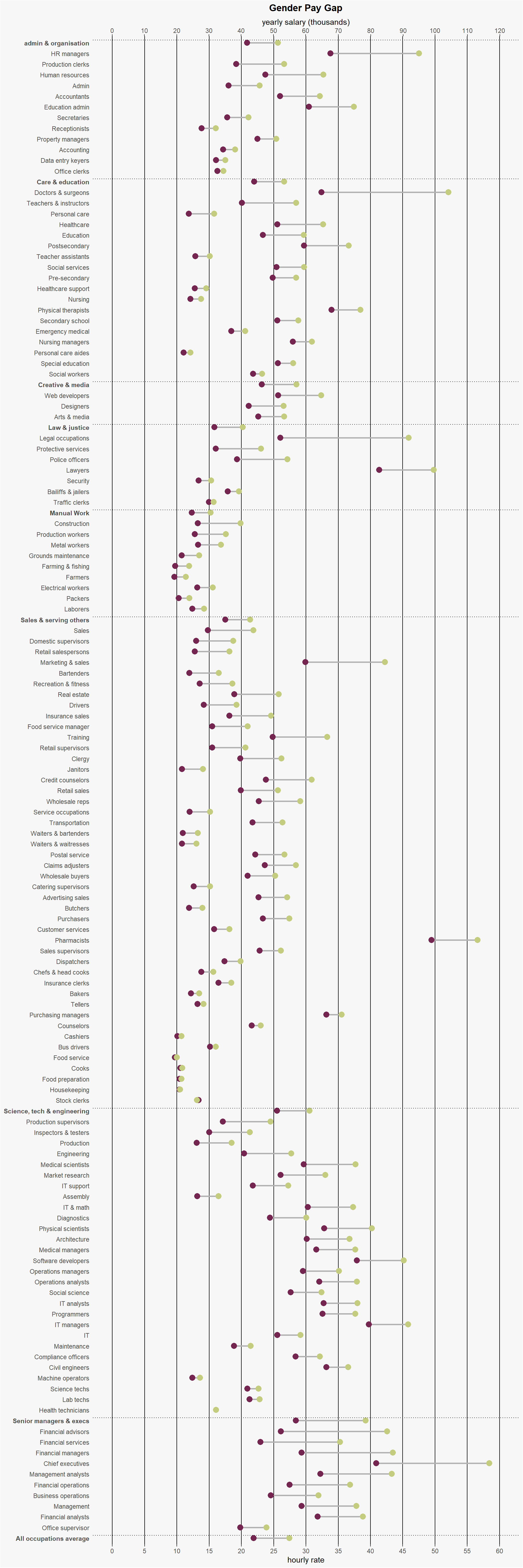
Original Image
The image below was published in Information is Beautiful. https://informationisbeautiful.net/visualizations/gender-pay-gap/
Data Preparation
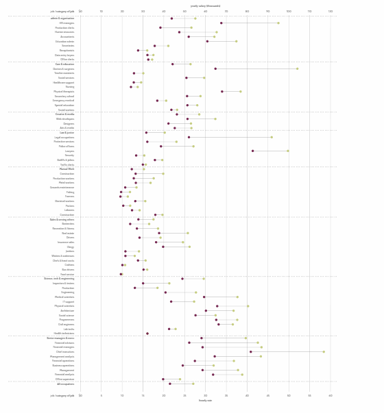
Below is the accompanying code to reproduce the chart above. The data was sourced from US Bureau of Labor Statistics, UK Office of National Statistics, The Guardian Datablog.
library(ggplot2)
library(ggalt)
library(dplyr)

data <- readxl::read_xlsx('./data/gender_gap.xlsx', sheet = "US") %>%
  janitor::clean_names()

### Remove duplicates based on occupation without changing order
data <- distinct(data,occupation, .keep_all= TRUE) %>% mutate(row_no = row_number())

categories <- c("admin & organisation","Care & education","Creative & media","Law & justice","Manual Work","Sales & serving others","Science, tech & engineering","Senior managers & execs","All occupations average")

data <- data %>% mutate(face = ifelse(occupation %in% categories,"bold","plain"),
                        cut = ifelse(occupation %in% categories, nrow(data) + 1 - row_no ,NA))
GGPLOT2
ggplot(data, aes(x=women_average_annual_salary, xend=men_average_annual_salary, y=reorder(occupation,-row_no))) +
  geom_dumbbell(colour_x="#752650",
                color = "#b2b2b2",
                colour_xend ="#c4cc80",
                size = 1,
                size_x = 3.5,
                size_xend = 3.5) +
  scale_x_continuous(breaks = seq(0,120000,10000), labels = seq(0,60,5), limits = c(0,120000),
                     sec.axis = dup_axis(labels = seq(0,120,10), name = "yearly salary (thousands)")) +
  labs(x="hourly rate",
       y = NULL,
       #y="job / category of job",
       title="Gender Pay Gap") +
  theme(plot.title = element_text(hjust=0.5, face="bold"),
        plot.background=element_rect(fill="#f7f7f7"),
        panel.background=element_rect(fill="#f7f7f7"),
        panel.grid.major.y=element_blank(),
        panel.grid.major.x = element_line(colour = "black"),
        panel.grid.minor.x = element_blank(),
        axis.ticks.y = element_blank(),
        axis.text.y = element_text(face = rev(data$face))
#        axis.title.y = element_text(hjust = 0, vjust = 0, angle = 90, face = "bold")
        ) +
  geom_hline(yintercept = data$cut[!is.na(data$cut)] + 0.25, linetype = "dotted")