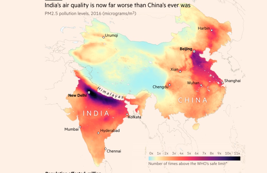
Original Image
The image below was featured in Financial Times News website. https://ig.ft.com/india-pollution/
Data Preparation
Below is the accompanying code to reproduce the chart above. The data is downloaded from Nasa Socioeconomic Data and Application Centre.
library(rnaturalearth)
library(rnaturalearthdata)
library(ggplot2)
library(dplyr)
library(ggrepel)

# file <- 'gwr_pm25_2016.tif'
#
# gdalUtils::gdalwarp(srcfile = file,
#                     dstfile = sub('\\.tif','_resampled.tif',file),
#                     tr = c(0.1,0.1),
#                     r = 'bilinear')

labels_df <- data.frame(stringsAsFactors=FALSE,
                        place = c("New Delhi", "Chennai", "Hyderabad", "Kolkata", "Mumbai",
                                  "Wuhan", "Chengdu", "Shanghai", "Xian", "Harbin", "Urumqi","Beijing",
                                  "CHINA", "INDIA"),
                        long = c(77.209, 80.27, 78.48, 88.36, 72.88, 114.3, 104.06, 121.48,
                                 113.34, 126.53, 87.62, 116.4, 115, 78.96),
                        lat = c(28.614, 13.08, 17.38, 22.57, 19.07, 30.59, 30.57, 31.23,
                                33.62, 45.8, 43.825,39.9, 28, 20.593),
                        font = c("bold","plain","plain","plain","plain","plain","plain","plain",
                                 "plain","plain","plain","bold","plain","plain")
)

places_df <- labels_df %>% filter(!(place %in% c("CHINA","INDIA")))
countries_df <- labels_df %>% filter(place %in% c("CHINA","INDIA"))

data <- raster::raster('./data/pollution/gwr_pm25_2016_resampled.tif')

world <- ne_countries(scale = "medium", continent = "asia", returnclass = "sf")

data_df <- raster::as.data.frame(data, xy = TRUE)
data_df <- data_df %>% filter(!is.na(gwr_pm25_2016_resampled), gwr_pm25_2016_resampled > 0)
data_df$multi <- cut(data_df$gwr_pm25_2016_resampled,breaks = c(seq(0,110,10),Inf), labels = paste0(seq(0,11,1) %>% as.character(),"x"))

color_labels <- c("#A5E6F7","#FCF6C1","#FFCA8B","#FF9A68","#FF6951","#FB455A","#DD2E6E","#A92B63","#8C217D","#63277A","#3C2468","#151038")


names(color_labels) <- seq(0,11,1) %>% as.character() %>% paste0(.,"x")
GGPLOT2
ggplot()  +
  geom_raster(data = data_df,
              aes(x = x, y = y, fill = multi)) +
  geom_sf(data = world, fill = NA, colour = "grey") +
  geom_point(data = places_df, aes(x = long, y = lat), shape = 1) +
  geom_text_repel(data = places_df, aes(x = long, y = lat, label = place), segment.size = NA, fontface = places_df$font) +
  geom_text_repel(data = countries_df, aes(x = long, y = lat, label = place), segment.size = NA, colour = "white", size = 5, fontface = "bold") +
  scale_fill_manual(values = color_labels) +
  theme_classic() +
  theme(plot.title = element_text(size = 15),
        legend.position = "bottom",
        legend.direction = "horizontal",
        legend.spacing.x  = unit(0,"cm"),
        legend.key.width = unit(0.75, "cm"),
        legend.key.height = unit(0.5, "cm"),
        axis.line = element_blank(),
        axis.ticks = element_blank(),
        axis.title = element_blank(),
        axis.text = element_blank()) +
  labs(title = "India's air quality is now far worse than China's ever was",
       subtitle = "PM2.5 pollution levels, 2016 (microgram/m3)") +
  ylim(5,60) +
  xlim(60,140) +
  guides(fill = guide_legend(title = "Number of times above the WHO's safe limit",
                             title.position = "bottom",
                             nrow = 1,
                             title.hjust = 0,
label.position="top")) 