Original Image
The image below was published in New York Times. https://www.nytimes.com/2019/11/17/business/how-fedex-cut-its-tax-bill-to-0.html
Data Preparation
Below is the accompanying code to reproduce the chart above. The data was manually created by studying the chart.
library(dplyr)
library(ggplot2)
library(cowplot)
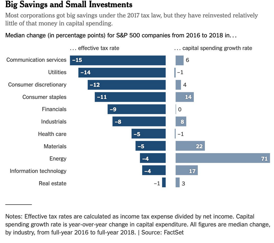
heads <- c("Communication services", "Utilities", "Consumer discretionary", "Consumer Staples", "Financials", "Industrials", "Health care", "Materials", "Energy", "Information Technology", "Real estate")
savings_investment_data <- data.frame(
heads = rep(heads,2),
by = c(rep("... effective tax rate",11),rep("... capital spending growth rate",11)),
value = Reduce(c,list(
etr = c(-15, -14, -12, -11, -9, -8, -5, -5, -4, -4, -1),
csgr= c(6, -1, 4, 14, 0, 8, -1, 22, 71, 17, 3)
)),
stringsAsFactors = FALSE
)
savings_investment_data$by <- factor(x = savings_investment_data$by, levels = c("... effective tax rate","... capital spending growth rate"))
savings_investment_data$heads <- factor(x = savings_investment_data$heads, levels = rev(heads))
dataetr <- dplyr::filter(savings_investment_data, by == "... effective tax rate")
datacsgr <- dplyr::filter(savings_investment_data, by == "... capital spending growth rate") %>% mutate(
position = ifelse(value>=8, value-2, value+1),
position = ifelse(value<0, value+5, value-2),
face = ifelse(value>=8, "bold", "plain"),
color = ifelse(value>=8, "white", "black")
)
# credit @ https://stackoverflow.com/questions/50973713/ggplot2-creating-themed-title-subtitle-with-cowplot
draw_label_theme <- function(label, theme = NULL, element = "text", ...) {
if (is.null(theme)) {
theme <- ggplot2::theme_get()
}
if (!element %in% names(theme)) {
stop("Element must be a valid ggplot theme element name")
}
elements <- ggplot2::calc_element(element, theme)
cowplot::draw_label(label,
fontfamily = elements$family,
fontface = elements$face,
colour = elements$color,
size = elements$size,
...
)
}GGPLOT2
# Left half of plot
plhs <- ggplot(data = dataetr) +
  geom_col(aes(x = heads, y = value), fill = "#1E4B75", width = 0.8) +
  geom_text(color = "white", aes(x = heads, y = value + 0.7, label = value), fontface = "bold",
            size = 4) +
  coord_flip() +
  theme_classic() +
  theme(
    legend.position="none",
    axis.line = element_blank(),
    axis.text.x = element_blank(),
    axis.text.y = element_text(face = "bold", size = 13),
    axis.ticks = element_blank()
  ) +
labs(
  x = NULL, y = NULL, title = "... effective tax rate"
  )

# Right half of plot
prhs <- ggplot(data = datacsgr) +
  geom_col(aes(x = heads, y = value), fill = "#7D96B0", width = 0.9) +
  geom_text(aes(x = heads, y = position, label = value), size = 4, fontface = datacsgr$face,
            color = datacsgr$color) +
  coord_flip() +
  theme_classic() +
theme(
  legend.position="none",
  axis.line = element_blank(),
  axis.text = element_blank(),
  axis.ticks = element_blank()
) +
labs(
  x = NULL, y = NULL, title = "... capital spending growth rate"
  )

# adding side by side using cowplot
plot_row_gg <- plot_grid(plhs, prhs)

# adidng title and subtitle which will be appended using cowplot
title_gg <- ggplot() +
  labs(title = "Big Savings and Small Investments",
       subtitle = "Most corporations got big savings under the 2017 tax law, but they have reinvested relatively little of that money in capital spendings\n\nMedian change (in percentage points) for S&P 500 companies from 2016 to 2018  in...") +
  theme_classic() +
  theme(
    legend.position="none",
    axis.line = element_blank(),
    axis.text = element_blank(),
    axis.ticks = element_blank(),
    plot.title = element_text(size = 21, face = "bold"),
    plot.subtitle = element_text(size = 13.5, face = "plain", colour = "grey")
  )

with_title <- plot_grid(title_gg, plot_row_gg, ncol = 1, rel_heights = c(0.2, 1))


p1 <- add_sub(plot = with_title,"\nNotes: Effective tax rates are calculated as income tax expense divided by net income. Capital spending growth rate is year-over-year change in capital expenditure.",hjust = 0.40,size = 14)
p2 <- add_sub(p1,"All figures are median change, by industry, from full-year 2016 to full-year 2018. | Source: FactSet",hjust = 0.67, size = 14)
ggdraw(p2)